boy peeking through door jam - documentary family photography

Community Critique – Jenni

Community Critique

Today we have an image critique from Jenni who describes herself as an amateur enthusiast.  She snagged this image of her son sneaking a peek at the TV while he should have been getting ready for bed with her iPhone.  Critique today comes from Heather, Lacey and Natasha.

Heather:
I love that instead of missing the moment that you grabbed the camera that you had on hand. This has a great balance to it. It feels evenly weighted. The lighting is really good. You have a light coming from the left to light your hubby and the light coming from behind your son. I would love to see what they are both looking at included in the frame. I know stepping back or to the side is not always an option inside our homes. It would be fun if you could plan to wait for this moment to happen again and have your big camera ready. I would love to see it with a narrow aperture to have them both in focus. It is such a fun moment. Great photo!

Lacey:
This is such a great moment of your son peeking in on your husband. You can really feel that it is happening at night when he should definitely already be in bed. It’s a moment so many of us as parents can relate to! For your composition you did a great job framing your son in the stairwell, so that he is all in meaning that his arm isn’t cut off by the edge of the frame and you shot from high enough of an angle that the posts are not coming out of the top of his head. I also like that you did not cut off the posters and that they are fully included in the frame. However, I think if you changed your angle and gotten a bit higher you could have included all of your husband’s legs in the shot, as well as, gotten a better angle on the arm of the couch that is in the bottom right of the image (or been able to cut it out completely).

The lighting works well to help balance the image. Your husband has light falling on him from the left which helps illuminate him as he sits in the middle of the dark couch. Your son has the opposite effect, where he is wearing dark clothing and in relative shadow and the background behind him is very bright. The color palette is also very restrained with only the primary colors in play. Dark blue is the predominate color represented in the couch and throw pillows, the pajamas, and the poster. Red is also repeated throughout in the posters, your husband’s shirt, and son’s top. Then there are just hints of yellow with your son’s hair and pajama bottoms.

My favorite iphone app to edit on is the Filmborn app by Mastin Labs. Its camera makes it easy to adjust exposure and color temp in the moment and then its editing tools after the fact can really help push an image to the next level. I recommend downloading the app and playing around with this image to see if you can use color theory to really bring out the underlying strengths of the image.

Natasha:
You have captured a good moment here! I like the story it tells – I’m imagining your son having been tucked up in to bed, only to then sneak down those stairs behind him & peek in on his Dad. I think that you did a good job on the framing. From the look of the chair arm in the bottom right corner, I’m going to assume that this restricted you from getting slightly further back so as not to crop your husbands feet. Sometimes decisions have to be made about what is more important to keep in the frame, & I think you made the right decision ensuring that your son was all in the frame, as opposed to slicing part of him out of the frame to ensure your husbands feet are in the frame. for your restrictions, you have composed this well, keeping the tops of the framed pictures in, your son’s head framed by the base of the stairwell(not slicing through his head), having your husbands legs coming out of the bottom left corner of the frame & the arm of the couch out of the right hand corner. It’s well balanced. I think that it is great that you chose to take the photo with your iphone rather than miss the moment because you didn’t have your DSLR – I am a firm believer that it doesn’t matter what you use to capture photos, if you are using the same principles of composition & story that you would while using a a DSLR. This is not a scene that would have benefited from a shallow depth of field, so the iphone was perfect for this. Using the editing tools on your phone, in an app or exporting your iphone photo into LR can really help to enhance the colours in your photo & to give it that final polish to take it from being just an iphone photo to making what you used to take the photo irrelevant.

*****
Interested in having one of your images critiqued? Check out the submission guidelines.

girl looking up at adult

Community Critique – Bonnie

Community Critique

Today we have an image to critique submitted to us by Bonnie of Bonnie Hussey Photography.  This image was shot with a Canon 6D and a Sigma 24mm f/1.4.  Critique this week comes from Jessica Uhler, Lacey Monroe, & Natasha Kelly .

girl looking up at adult

Jessica:
I love the moment you captured here- it is intimate and specific and shows so much of the girl’s personality and the uniqueness of her facial features but it’s also very relatable to other parents. I love how she has a little curl of a smile. Usually I don’t like shooting down and kids, but in this case the perspective highlights the relationship of the child to the photographer- a closeness, a comfort.

I wonder what this would look like in color. I think the tattoo could add interesting texture and context to the story. I love the contrast and warmth of low-light color images and I think it could make this image much more interesting. The composition has a lot of negative space, and the perspective gives it almost an abstract quality. I wonder if you could have included more details in the frame to tell a bit more of the story- location, texture, inside, outside, etc. The lack of depth of field does isolate the subject and make this image more of a portrait, but it is a portrait of a relationship and I wonder if you could have stopped down a little to allow the viewer’s eye to go deeper into the frame. Also, the right side of the frame feels a bit too dark. Try bringing up the shadows a bit so we can see some detail there.

I like how your arm creates a diagonal line into the frame and connects the subject to the viewer/photographer.

Great job making this image!

Lacey:
This is such a darling photo that tugs on the heartstrings of any parent. The utter love and adoration you capture in the little girl’s face is something that a parent will cherish more and more with each passing year. Having the hand in her hair reinforces the connection between parent and child, as well as, it is a strong diagonal to guide the eye in the composition. The soft light that is reflected back onto the shadowed side of the child’s face is quite lovely and adds dimension that might otherwise have been lost to the dark tones of the hair.

There are few things I would suggest to try next time to make this even stronger. I would angle the camera slightly up to cut off the blurred body part at the very bottom of the image. The blurring interrupts the strong compositional line from the arm. I would also take back the vignetting a touch. The right side vignette looks very natural with the fall off of the light, but the top left corner is noticeably darker than the surrounding areas and that contrast pulls my eye away from the intended focus of the image. The last thing I would say you could try is to give the photo more context. As is the background is completely out of focus and clear of environmental details. I would guess it is inside on carpet based on the soft modulations in grayscale, but if you were to stop down a bit and show some of the background it could give the photo more of a sense of place. All in all, a lovely picture that any parent would be happy to have so they may be reminded of just how dearly they are regarded by their little ones.

Natasha:
This is a really sweet moment capturing a sweet expression, & I’d say it would be a universal moment for parents – we could all relate to it.

I like that the photograph includes the photographers arm, which helps lead us into the picture. I would have liked to have seen more light on the right hand side so that we could see both of her eyes. I would have also liked to have seen a greater depth of field. I think that if you had stopped down a little more, say to an aperture of 3.5, we would have been able to see more of the little girls face in focus & that would have made for a stronger image.

I do like the composition & perspective of the photograph. Leaving a little more room between the top of the little girls head & the top of the frame would have given the photo a little more breathing room without changing the intent of the photographer. I would have liked to have seen what this photo would look like in colour – to see the little girls eye & hair colour, the colours of the tattooed arm, I think this would have added a bit more depth to the photograph.

This is a lovely, sweet portrait of the little girl & no doubt a lovely memory to have photographed.

Interested in having one of your images critiqued? Check out the SUBMISSION GUIDELINES HERE.


Community Critique – April

Community Critique

This week we are critiquing an image from April, a mother of 6. She submitted this image that she shot with her iPhone 6, which goes to show that the best camera is the one that you have with you.  She selected Jodie, Gemma, and Jessica to give her critique.  Below is her image along with our contributors had to say.

kids play in sprinkler - documentary family photography

Gemma:
I immediately feel the warmth and hear the giggles just looking at this photo – it’s a pure joy moment! And how many times have we all watched kids run through sprinklers? It’s such a classic summertime activity that I’ve photographed with my own boys on many occasions but can’t ever get enough.

First off, I like that this isn’t a typical 3:2 ratio crop – this may also work well as a square. If there’s any way to adjust a touch to the right of the frame to get her whole shadow, (which would only cut out a touch of the fence on the left of the frame), I’d give that a try. Showing her whole shadow should give just a smidge of better balance because he is so large on the left side and her + her full shadow will be close to the same proportions. The exposure is great for bright mid-day sun and I really like that you’ve retained the blue sky because it really adds to the summer feeling. You made a smart choice of shutter speed to freeze all of the droplets of water spray and the movement of the kiddos as they are running through them. I also like how both subjects are in focus, so great job with selecting an appropriate aperture for the scene. Their expressions are priceless (and I want to see more!!). This is an easy fix by taking a small brush in Lightroom to lighten the shadows in their faces just a tiny bit. In this situation, the only thing I would have done differently is try to get a tiny bit lower to make the fence block the tops of the roofs in the background. My eye does get pulled back to shapes – the triangle and rectangle – when I really want to look at the action happening in the foreground. That would have also made his jump appear a little higher in the air as well, which is always fun!

Jessica:
First of all, I think the colors in the image add to the story of the moment- bright summer sun, childhood, happiness. The moment and gesture are good. I like the directional tension of the boy moving one way into and through the water and how his hand leads backward to the girl who is moving away from the water. The position of their bodies and the angles of their limbs help create visual interest and movement in the frame.

The composition could be stronger. I do like the leading lines of the fence and the grass line and how they create strong diagonals leading the eye in to the frame, but since they intersect with the boy’s head they become a distraction. If you had gotten down lower and shot up toward the kids several things would be accomplished: the boy’s head would be against the clear negative space of the sky and the children would become larger in the frame, making both them and the moment more dramatic. Another option would be to stand on something and shoot down on them, so that they are contained within the frame of the grass.

I think a bigger aperture might have worked better as well. I’m guessing this was shot at a fairly small aperture- maybe f8 or f11?- because of how much depth of field you have all the way back to the rooflines behind the fence. I think stopping down just until the two kids were in focus would make the frame feel more intentional and help the viewer’s gaze.

Another thing to experiment with is slowing your shutter speed to convey movement. It would create a totally different look and feel to have the water and children a bit blurred, but since that movement is so much a part of the story it could make for an interesting and emotional image. Sometimes the most technically accurate or sharp image isn’t the one that truly represents the feeling of a scene.

Overall I think the exposure, colors and moment are good. The image is full of the joy of summer as a child. With some practice changing your perspective you can strengthen the story of images you make.

Jodie:
I love the leading lines in this image! they bring your eyes through the photo perfectly. The rays of the sun help lead you into the action within the photo then the fence leads you left to right.

The placement of the children is great! They are clearly together yet with the separate actions captured are still individual! Their expressions are gorgeous! it really is a fun image and tells the story of how much fun running under a sprinkle really is!

your exposure is great. I may bump the shadows slightly to lighten the kids faces but you can still see all their details clearly (including the lost tooth gap! that is awesome!)

The pop of  the pink in the girl’s hat and swimmers breaks up the cooler tones of the blues and greens in the sky and grass and the darker tones of the fence. her placement using the rule of thirds is yet another component to this image that really makes it work.

Overall, I love this image! its such an iconic fun summer day under the sprinkler and has captured the essence of childhood perfectly!

Interested in having one of your images critiqued? Check out the SUBMISSION GUIDELINES HERE.

father reads to daughter - https://www.shamoftheperfect.com/september-26-2016/

Community Critique – Constantino

Community Critique

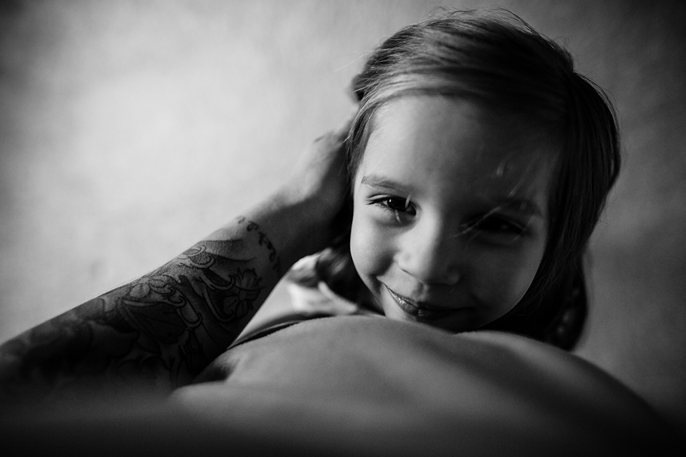
We have a new critique to share today.  This image was sent in from Constantino, a lawyer turned photographer, in Peru.  He tells us this image was taken during a newborn session during which the father took a few quiet moments to entertain the new big sister.

Included below is critique from 3 of our contributors:
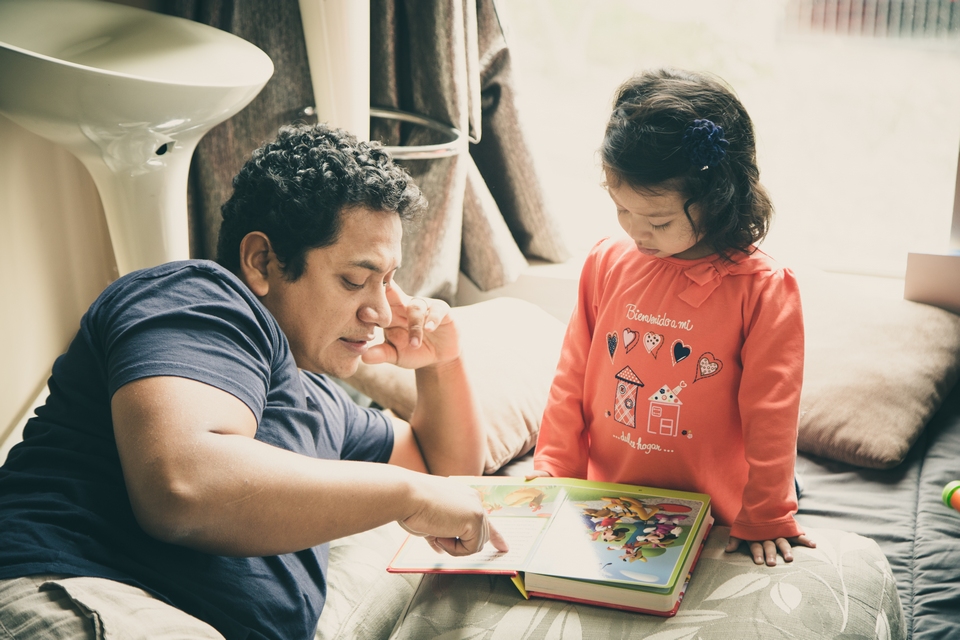
father reads to daughter - https://www.shamoftheperfect.com/september-26-2016/


Lacey:

I love the moment you chose to capture! It is a normal everyday moment in the life of a family with a young child, but it still contains lots of tenderness and affection. The gesture of the father pointing to the words of the story really drives home the interaction. Having both father and daughter look at the book helps create a triangle in the composition to lead the viewers eye. Well done! There a couple of things you could do to make this photo stronger. If you adjusted your body position so that you were lower down and to the left just a bit, you could clear up the background behind dad’s head. Right now there are chairs that intersect his head. Moving around to create a clean background behind him could help focus the photo on the interaction at hand. I would also suggest having the color edit be more true to life. For the most part, photos that have more natural edit will stand the test of time better than those that have obvious filters or trendy coloring. I also think this photos would be a great candidate to convert to a black and white photo. The light on the father and child have a nice sculptural quality which would look great in black and white. Thank you so much for sharing this photo!

Me encanta el momento que hayas decidido capturar!  Es un momento cotidiano en la vida de una familia con niños pequeños, pero aún así contiene mucha ternura y amor.  El gesto del padre que apunta hacia las palabras subraya la interacción entre los dos.  El hecho de que ambos el padre y la hija se fijan en el libro ayuda a crear un triángulo en la composición que atrae la vista del espectador.  Bien hecho!  Hay algunas cosas que podrías hacer para hacerla aún más fuerte a la foto.  Si movieras la posición de tu cuerpo para que estuvieras más cerca del suelo y un poco a la izquierda, podrías aclarar el trasfondo detrás de la cabeza del padre.  Como está ahora, hay unas sillas que cortan su cabeza un poco.  Al moverte para hacer que no haya nada detrás de su cabeza serviría para asegurar que el enfoque en la foto cae en la interacción entre los dos.  Además, sugiero que mantengas los colores en la foto más cerca de cómo están en la vida real.  Por lo general, las fotos que parecen más naturales duran tras los años mejor que las que tienen cambios a través de los filtros o tienen colores de moda en el momento.  También me parece que sería un buen candidato para ser foto de blanco y negro.  La luz que cae sobre el padre y la hija tiene una calidad de escultura que se vería bonita en blanco y negro.  Muchísimas gracias por compartir la foto!


Jenny:

What a sweet daddy daughter moment you’ve captured! These are always some of my favourite images!

I absolutely love backlighting, but it can be so tricky to work with. I have no problem with blowing highlights in windows, or skies, but I try to keep the detail as much a possible in the areas that are important to the story. You have some hot spots on the book they are reading and on the words that he is pointing to, and I personally would love to see that detail. I wonder if you were to get down lower and come in really tight from the left a bit and shoot from the book up at their faces if that would help avoid it. It would also highlight not only their activity, but their connection without the background distractions. I would also like to see it shot from behind them looking down at a bird’s eye view so you would be blocking that hot spot on the book and would capture the words and pictures, especially if this is a favourite story of hers. Another option, would be to shoot it really wide, again low from their level and probably off from the left a bit to avoid the harsh light, so we can see dad stretched out laying on the floor and the toys around them.

If she is anything like my kids, reading books happens over and over and over again, so you should have lots of opportunities to shoot this scene again. Thanks so much for sharing your work with us, I look forward to seeing more!

Qué momento más tierno entre padre e hija que has capturado!  Siempre son algunas de mis imágenes favoritas!  Me encanta la luz de trasfondo, pero puedo ser muy difícil de manejar.   No tengo problema con el uso de toques de luz en ventanas o cielos, pero intento mantener todos los detalles posibles en las partes que forman una parte importante de la historia.  Tienes unas toques de luz sobre el libro que están leyendo y sobre las palabras, y personalmente me encantaría poder ver esos detalles.  Me pregunto si podrías agacharte aún más y acercarte más desde la izquierda y sacar la foto desde el libro mirando para arriba hacia sus caras.  Pondría en relieve no solamente su actividad sino además su conexión sin el fondo para distraer.  Me gustaría también ver la foto sacada desde atrás de ellos, como vista de un pájaro, para poder ver más el libro y las palabras, especialmente si en un libro favorito de ella.  Otra opción sería sacar con la vista gorda, desde abajo cerca, de su nivel y a la izquierda un poco para evitar la luz severa, para poder ver el padre tirado en el suelo rodeado por los juguetes.  Si ella es similar a mis hijos, leer los libros en una actividad que se repite miles de veces, así que imagino que tendrás muchas oportunidades más para sacar fotos de esta escena.  Muchísimas gracias por compartir tu trabajo con nosotros.  Tengo ganas de ver más en el futuro!


Michelle:

I love this simple moment with daddy and daughter and how they are both completely immersed in it, unaware of the camera. Reading with your children is such a special moment of connection and that window of opportunity to share the experience is so narrow as they grow up.

I can tell there is amazing back-light in this room – lots of yummy light to work with. However, I feel like you were a bit afraid of the shadows here. The background is blown out which bothers me less than the highlights on dad’s arm and hand. Possibly you were trying to expose for the shadows on their faces but I would have embraced the shadows. To me, whether this was done in-camera or in post-processing, this photo is about a stop or so over-exposed. With the right angle and possibly lower ISO (eliminating some of the noise in the process), you may have been able to use the light that is coming in to just catch enough of both of their faces and get more of a dynamic range.

Changing your angle may also have helped change the location of some of the distracting elements in the image. It’s not that you want to start taking stuff out of the image – this is real life after all – but more be aware of where those items are showing up. Like the white pedestal coming out of your husband’s head. Squishing yourself against the left wall a bit might have helped with that, and then maybe squatting to more of their level, both of which would also have helped us see more of your daughter’s expression too. An alternative would have been to go completely in the other direction and move yourself to the right, facing your husband and the wall. This would have solved some of the backlighting issues too, giving you some beautiful side light – and it looks like there is enough bounce light coming from the book that your daughter wouldn’t be completely in shadow.

Finally, I think the processing, at least for my tastes, is under-saturated and I see this most in the reds and oranges which are almost completely absent from the color range. The result is that the skin tones seem a bit sallow, and I can tell particularly in the lips where there are no red tones at all. Maybe you were struggling with color balance in the room – which can happen when you’re working in the shadows – in which case perhaps I would try a black-and-white treatment on this image instead.

Overall I think you captured a wonderful moment and had great light to work with; you obviously identified that by picking up your camera, so you have a good eye and great instincts! My overarching recommendations are to circle your subjects more to explore the light from different angles, see how it plays on your subject’s faces, and embrace the shadows in the process.

Me encanta este simple momento con el papá y la hija y cómo ambos están completamente sumergidos en ella, sin darse cuenta de la cámara. Leer con sus hijos es un momento tan especial de conexión y esa ventana de oportunidad de compartir la experiencia es tan estrecha a medida que crecen.

Les puedo decir allí es increíble vuelta de la luz en esta sala – mucha luz delicioso para trabajar con ellos. Sin embargo, me siento como si fueras un poco de miedo de las sombras aquí. El fondo es soplado a cabo lo que me molesta menos de los aspectos más destacados en el brazo y la mano de papá. Posiblemente estuviera tratando de exponer para las sombras en sus rostros, pero me hubiera abrazado las sombras. Para mí, si esto fue hecho en la cámara o en el post-procesamiento, esta foto es de una parada o tan sobre-expuesta. Con el ángulo recto y posiblemente ISO inferior (eliminando algunos de los ruidos en el proceso), es posible que haya sido capaz de utilizar la luz que está llegando a simplemente coger lo suficiente de ambos de sus caras y obtener más de un rango dinámico.

Cambiando el ángulo también puede haber contribuido a cambiar la ubicación de algunos de los elementos de distracción en la imagen. No es que usted quiere comenzar a tomar cosas de la imagen – esto es la vida real después de todo – pero más ser consciente de dónde esos artículos se están presentando. Al igual que el pedestal blanco que sale de la cabeza de su marido. Aplastando a sí mismo contra la pared izquierda un poco podría haber ayudado con eso, y luego tal vez en cuclillas a más de su nivel, los cuales también habría ayudado a ver más de la expresión de su hija. Una alternativa habría sido ir por completo en la otra dirección y mover por sí mismo a la derecha, frente a su marido y la pared. Esto habría resuelto algunos de los problemas de iluminación de fondo también, que le da un poco de luz lado hermoso – y parece que hay suficiente luz rebote procedente del libro que su hija no estaría completamente en la sombra.

Por último, creo que el procesado, al menos para mi gusto, es bajo-saturada y veo esto más en los rojos y naranjas que están casi completamente ausentes de la gama de colores. El resultado es que los tonos de piel parecen un poco cetrina, y puedo decir sobre todo en los labios donde no hay tonos rojos en absoluto. Tal vez estabas luchando con el balance de color en la habitación – lo que puede ocurrir cuando se trabaja en las sombras – en cuyo caso tal vez me gustaría probar un tratamiento blanco y negro en esta imagen en su lugar. En general, creo que ha capturado un momento maravilloso y tenía gran luz que trabajar; es obvio identificado que al recoger su cámara, por lo que tiene un buen ojo y un gran instinto! Mis recomendaciones generales son en dar la vuelta a los sujetos más para explorar la luz desde diferentes ángulos, ver cómo se juega en las caras del sujeto, y abrazar las sombras en el proceso.


Interested in having one of your images critiqued? Check out the submission guidelines here.

Boys on Jungle Gym - documentary family photography

Community Critique – Manuela

Community Critique

Today we have an image critique from German photographer and mother, Manuela of Manuela Niederreiner Photo & Design. Below is what our 3 contributors, selected by Manuela, had to say:

Boys on Jungle Gym - documentary family photography

Chrystal:
I feel immediately drawn to this image because of the interesting lines. The crop is great with the upwards diagonal line going straight into the corner. The movement and energy also add energy and tell a happy story of summer and outdoor play. I’m glad you chose an image with his foot moving up onto the next bar because it really highlights what’s happening in the scene. Typically, I prefer black and white conversion only when there’s dramatic directional light (like direct sun from the side) or when I’m trying to highlight a dramatic emotion. Because the light looks more even and the mood is playful, I would love to see this in color also. The boy on the net seems to be a little camera aware so it might be more impactful to see him laughing bigger or concentrating harder just for effect but it’s still very happy and playful as is. If I had this playset I’d definitely make one from square below the net shooting up as well. Seems like endless possibilities! Thank you for sharing this with us, looking forward to looking at more of your images!

Jodie:
What a fun image! Really screams out Summer holiday fun!

I love the flow through the image that the positioning and framing makes! The action of the climbing up and over the play equipment really cements the feel of flowing through the image as the frame of the ropes follows right through to the outer edge of the image.

I do feel that the silver pole that is very prominently centre and eye catching with the sun’s highlights hitting it a bit distracting and eye catching. I wonder that if by moving slightly to the right this may have been avoided as well as be able to minimise the tree in the bottom right corner, and be able to see a little more of the climbing boy on the ladder’s expression slight more completely. However as a mother of boys I am totally aware that these moments are so fleeting that telling the kids to hang on a sec to get in a  better position is paramount to not even getting the image LOL I love the hint of the smile on both boys.

I would love to see it in colour – especially if the blue skies were really popped as I feel that it can add to the feel of the fun and happy emotions of the image. I suspect however that the technical side may have been a tad more difficult to achieve this as I suspect getting the right exposure on the boys faces would possibly blow the sky without using some sort of fill flash ( and again fast moving boys LOL) the pops of colour in clothing and the play equipment may help bring the story together. But I love how the BW eliminates distracting elements if the colours were clashing and distracting.
The conversion of BW is well contrasted and I am bump the shadows up a little bit to brighten the kids faces just slightly but that is more a personal preference than a must do next time statement. The exposure seems consistent with the intent of the image and the conversion shows that.

In a post processing thought I would probably have removed the tree in the bottom right corner. I know that it gives a sense of location but I feel that the clean feel of the image is drawn away a little bit with it almost cluttering the corner. The rest of the image is really clean lines and clear background. Its not a game changer for the image though, just a personal thought of an editing possibility.

Overall I feel this image is a solid documentary image that tells the story of fun spring/summer day at the park or play ground that really captures the essence and feelings of that experience.

Vicki:
This is a great image which is a strong and bold image of play. It has a strong composition, using the play frame to give structure to the image. The lines are well placed to frame the children and the tree in the background gives the sense of being in the park. I love that this is a different perspective of playing in the park too which adds to the composition.

To make it even bolder you could isolate the first child more by either hanging on a second until his face was in the grid of the netting or moving slightly more underneath, that way there would be a gap of sky between the frame and body and so gives more focus to the subject. I like the black and white here but am wondering if a little more contrast could help make it a touch more punchy. I tend to use colour for these kind of images as I think it can add to the story of play and the fun they are having. It depends on the colour of the sky and how bright it was, as you have exposed for the children the detail in the sky gets lost but this adds to the composition here in black and white.
That said, they are clearly having fun and I love the feeling of adventure and you can see that the first boy (big brother?) is being very brave and is eagerly followed by the second boy. There is a strong sense of story telling, I’d like to see the image once they’d made it over the top too!