Community Critique – Loren

Community Critique

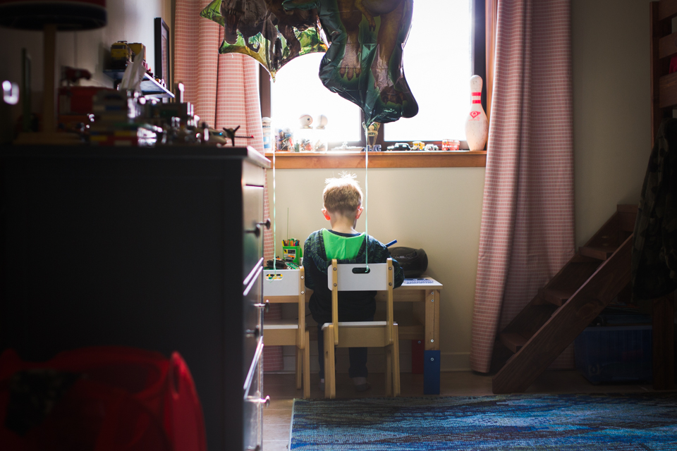
This week we have a photo submitted for critique by Loren Haar who took this photo of her son who loves bicycles. She tells us, “We were heading up Figueroa Mt. in Santa Ynez, Ca in search of wildflowers. The kids got tired of driving so we stopped for a snack. My boy loves bikes so when I saw a cyclist coming up the hill I looked to see if I could capture the moment that he saw the cyclist. Even better that the rider looked over at my son at just that second.”

This image was shot with Canon 6D, Canon EF 24-70L II and the specs are ISO 100, aperture f/3.2, and shutter speed 1/640s.

Critique today comes from Felicia, Carrie, and Leslie.

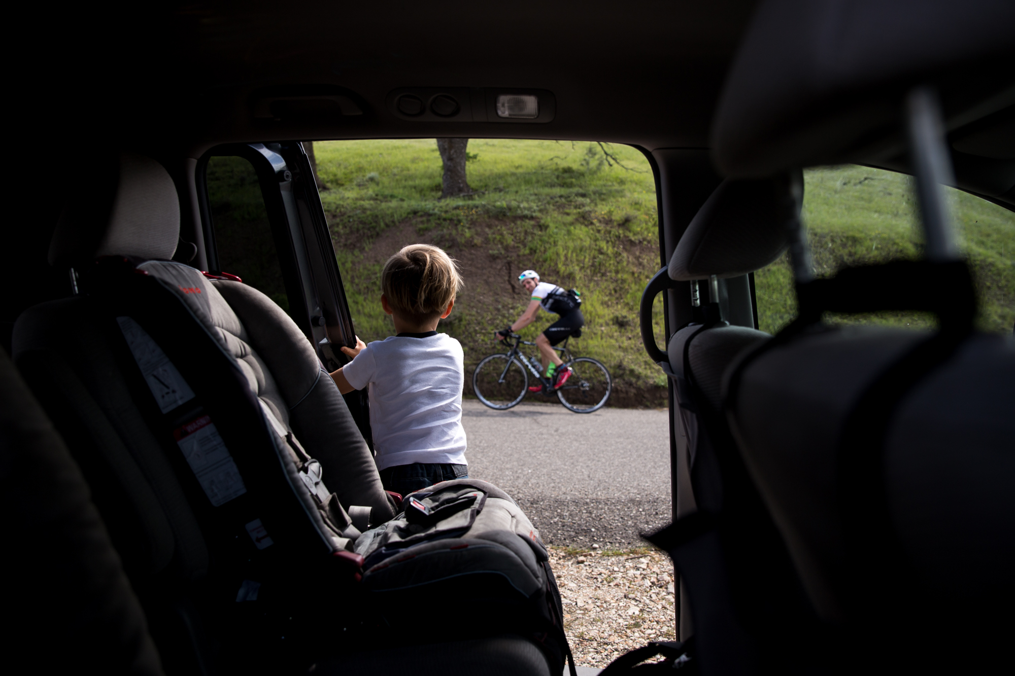
Felicia: You have exposed well for the image to retain all the detail of the outside light and managed to include enough of the shadows to allow for a nice fall off from outside to inside. The framing is also well timed, with enough information about the environment of where you are (paved road, grass, tree). However, the moment (for me) may have been stronger if the focus had been on the cyclist instead of the back of your son. For a viewer who didn’t know your back story, the visual weight is assigned to the back of a boy (whom we don’t necessarily know is your son). However, the human face of the cyclist (with unplanned camera awareness) is also vying for our attention, but is not in focus. This tension may or may not be intentional but it is present.

Carrie: This is a lovely photo. You have great dynamic range here, where you preserved enough details in the shadows for me to recognize the inside of the vehicle and know that it’s a minivan. Your artistic choice to make your son in focus and the outside scene blurry makes me view this as a story about the little boy, and his view and thoughts on the world. I, myself, have been working on shooting more closed down to add more layers & complexity to my photographs. In looking at your settings, you had ample room to raise your ISO so that you could close down your aperture and also get the bicycle rider in focus. It’s tough to do indoors, but outside it’s a great thing to try! Framing is excellent, and you made good use of your zoom lens. Good timing in making the photo exactly as the biker was in the space between the open door and your son’s body.

Leslie: Love this perspective and the framing. It is timed well and there is some intrigue to the photo. I enjoyed reading your why behind the the capture b/c it gave me some context. Your son’s curiosity is apparent in the image; I wonder if some of those other elements you mentioned in your description could have included in the image to really push the story further. Including some evidence of your son’s snack or waiting until he turned slightly, so that you could see his excitement about bikes could have added a more context to the moment.

*****

Interested in having one of your images critiqued? Check out the submission guidelines.


Community Critique – Shea

Community Critique

This week we have a critique submitted by Shea Kluender who took this photo of a family in their last few days of being of a family of three before a new baby sister arrived.

This image was shot with a Sony Alpha 7II / 55 mm f/3.5 28-70 and 55 mm f/1.8, and the specs are ISO 500, aperture f/4.5 and shutterspeed 1/200.

Critique today comes from LisaJenny, and Leslie.

Lisa: It’s such an interesting transition to prepare one child for the arrival of another and ensure they don’t feel replaced or jealous, etc. I have four children and know exactly how bittersweet it can be. I love that she is holding both mom and dad’s hands to walk down the stairs. It tells me that she’s the only child at the moment since both parents are helping her. It also tells me how little she is because she still needs help walking down the stairs. I like the angle you shot from as the side of the house and railings create leading lines that take my eye directly to the subjects. I didn’t see dad in the frame right away. I wonder what this looks like in color and if the colors of dad’s outfit can help to add separation from mom since they are merging here. I also think color may help the family stand out more against the backdrop of the grass. There’s also something sticking out of her head and I’m assuming it’s her hair but I’m not certain. Another thing that color may help to distinguish.

I can’t tell that mom is expecting, so perhaps shoot through this moment until she sort of turns to the side a little and we can see her baby bump. So maybe if you shot from the top of the staircase and waited for the family to reach the bottom of the staircase and walked out towards the grass, there may be more separation between the three of them so we can see mom, dad, child and baby bump. I think showing that baby bump will help the storytelling aspect of this image. Overall, this is a really sweet moment that the family will absolutely cherish. What a great memory to have before the new baby comes. I hope they ask you for another session with the newborn!

Jenny: Awe, this is such a sweet image! I love your perspective of shooting down and from behind. All of the lines are great and I love that the little girl is holding both mom and dad’s hands and how their arms are all tangled. I do wish there was a bit more separation though between mom and dad, as dad’s arm gets a bit lost here and I didn’t notice him at first. Perhaps shooting through here and a moment or two after this one when he reaches the bottom of the stairs would space them out a bit more. If they were down at the bottom of the stairs you would also have a bit more space around them to work with and wouldn’t be chopping off their heads. I’m a huge head chopper in my images but I’m unsure if this is intentional or not here. However, it’s easy to say all that in hindsight and none of that may have been a possibility. With the image as is, I would be inclined to crop in even tighter, down to mom’s elbow, to really emphasise their arms and hand holding. This would also make the head chop look intentional.

The transition from one baby to two is a huge one and definitely one to be celebrated and I love that this family recognised that and booked you for a session to document it. However, due to the angle you’ve shot this image, I wouldn’t have known that mom was pregnant. I’m sure you have plenty of other images from the session where you can see her belly, so I don’t think it matters here as you’ve still captured such a sweet moment between a little girl and her parents when it was just the three of them, and it’s definitely one that the family will love. Great work and I can’t wait to see the newborn images!

Leslie: Shea, this is beautiful detail shot. As documentary photographers, it’s our job to not only tell the families’ overall story, but also show the small pieces and moments that make up their life. I think you did a great job illustrating those in this image especially after learning that this mom is expecting.

I love the leading lines and how it’s shot down. It does take a little bit of looking around for your eye take in all the elements of the image. For instance, at first, I didn’t notice that she was holding Dad’s hand, but after I did, it’s a sweet surprise to see she’s holding both of her parent’s hands because it adds emotion and connection to the image.

I tend to prefer b/w, but I think that this image lacks a little contrast and maybe color would help the eye focus and separate one person from another.

Since you have some background on why this moment is special, it helped you to recognize it and capture a something that mom and dad will appreciate and cherish. However, as a viewer seeing it for the first time, I think if you want to convey the full message, it could be done with a stronger image.

Beautiful work, thanks so much for submitting.


*****
Interested in having one of your images critiqued? Check out the submission guidelines.

Community Critique – Anonymous

Community Critique

This week we have an anonymous critique, and this image was shot with a Canon Mark III.

Critique today comes from Felicia and Lacey.

Felicia: For me, this image captures my attention first with its mirroring in posture. The way the cat and the girl are positioned with their heads to the left side of the frame; it brings an implied line to read in that direction. As eyes are trained to read from left to right, this introduces tension to the image.

There is a bright spot to the right of the frame that is distracting and understandably challenging to manage because of the white cat, without losing the texture of its fur. Exposure is managed well in this case as the cat’s highlights are not blown. Unless the girl moves out of this bright spot, it cannot be eliminated from composing the frame without compromising the significance of the mirrored postures.

Compositionally, I do think you could have gotten closer to eliminate a lot of the space around them as it doesn’t serve as effective negative space or add context to the image.

As strong as the mirroring in posture is, and the suggestive states of rest and relaxation between the girl and the cat, the moment itself is not a loud one. To me, I am intrigued with the far away look in the girl’s eyes, and it makes me wonder what she is thinking of, or where her thoughts are, although that gesture is seeminly unrelated to the cat cleaning its paw. In that way, the subjects are not connected or reacting towards each other, any more than their postures are mirroring. I want to see a moment that tells me something more about their relationship.

The choice to convert to black and white and the warm tint for processing is unclear to me. I am curious about the child’s wardrobe – are the colours going to be able to add more to the story of her as a subject? Are there subtle stains that add more information?

For me, this image leaves me wanting to know more about their relationship so I would ask, if you had to reshoot this, how can you shoot this differently to say something about their relationship?

Lacey: First off, I love the mirroring you were able to capture in this photo! Great eye! The conversion to black and white works well for this image as it further cements the repetition between the cat and the child. They become a matching pair in their light tone with dark mouth and eyes. Getting down low to eye level helped them be fully encompassed by the dark field of the sofa behind them. If you had been at a different angle where one of them broke the horizon line of the sofa the photo would not have the same effect. It looks like the image may be overexposed slightly. It appears that the light that falls on the child’s clothing is a bit overblown. I would recommend shooting at lower exposure to retain that information and then using some light dodging and burning to help equalize the high key area. Our eye as the viewer is drawn to the lightest area first, which is great as that bring emphasis to the child and cat, but it is not great for drawing the eye to the overblown shirt and pants and light area of the couch. Overall this is a strong photo, and utilizing the adjustment brush in lightroom to take care of the hot highlights will make it even better.

*****
Interested in having one of your images critiqued? Check out the submission guidelines.

Community Critique – Gabriella

Community Critique

This week we have a critique submitted by Gabriella Hunt. This image was shot with a Nikon D750 and Tamron SP 35mm F 1.8, and the specs are ISO 1600, aperture f/4 and shutterspeed 1/4000.

Critique today comes from Lisa, Leslie, and Jessica.

Lisa: Who knew such beautiful light could be found in a Chuck E. Cheese? Exposing for this light was a great idea to minimize the distracting elements in a busy restaurant. My eye goes directly to the children in the image, and it’s great that each child has at least a highlight on their face so we can read them well. I also like that each child has a different feeling going on. The little girl seems annoyed with her food, the little boy looks bored with his food, and the baby is crying about his food. Each expression tells me a little something about each child’s personality and how they feel about this dinner. You definitely captured the feeling of going out to eat with small children. I like your composition and that you left some negative space at the top of the frame to balance out the busyness at the bottom of the frame. I would like for you to have given a bit more space behind the baby to help us feel that he’s also part of the story and not just someone on the side of the frame (the focus is more on the two older children since he’s out of focus). So, maybe get lower and closer to tighten it up on the left, where the boy in the middle would end up being in the center of the frame. I feel like this will create the feeling that we are sitting right at that table as a participant, rather than shooting at the scene as an observer. It would feel more intimate that way which would create a stronger response from the viewer. But I think you did a great job capturing a fun moment in a less than ideal environment. I know it’s difficult for all the elements to come together for a perfect photo, but I think you did some great problem solving here to achieve a solid image. Thank you so much for submitting your photo for critique!!

Leslie: Great use of light and storytelling in this image. I love the bright vibrant colors and the chaotic mess at the table. The deep shadows combined with the harsh light let us know who you want us to focus on and I love that you can see the silhouettes of people in the restaurant. I can immediately recognize where you are and can guess the ages of the children. The stair step positioning of the kids adds interest and balance to the photo, plus their expressions and gestures really bring the image to life.

To make this image stronger, I would take a slight step back and shift my position to the left to try to create a triangle and eliminate some extra space on the left side. This might also allow you to crop the bright artificial light in the back which is moving my eye to the rear of the restaurant.

Excellent job capturing mixed lighting, story and the essence of what it’s like to dine with young children.

Jessica: Chuck E Cheese is definitely a challenging place to shoot. If I were going I probably would leave my camera, thinking that no interesting light would be available and the setting would be too chaotic. You dispelled that idea! You did a great job recognizing a complex composition and how to make your subjects stand out in a bright, colorful and chaotic environment. At first glance I thought it might be a kitchen table scene. I love how the light creates a tableau of the subjects, and how the eye is led diagonally through the frame following them. The colors are fantastic too- the warmth of the image suggests low summer sun and adds to that sense of hot, sticky exhaustion. I really love the girl’s face and how you caught her in the middle of swallowing or chewing. I wish the viewer could see a bit more emotional response from the boy in the middle- maybe if you shot through this moment for a few frames on either side you would catch some reaction on his face. Overall it’s a great image and you captured what you set out to say.

*****
Interested in having one of your images critiqued? Check out the submission guidelines.


Community Critique – Katy

Community Critique

Today we have an image critique from Katy who describes herself as an hobbyist photographer who is trying to learn is all. Katy has this to say, “I currently live in South Korea with my husband and two boys. My goal is to capture moments…real moments that will bring tears to my eyes many years from now.”

Katy captured this image using a Canon EOS Rebel T2i and a 35mm f1/4 lens. The specs are SS 1/160, f/2, ISO 200.

Critique today comes from Natasha, Jessica, and Lacey.

Natasha: This is a sweet quiet moment of your little boy. I like that you can see all of his belongings around his room, the way he is rocking forward on his chair. The framing of his head below the window sill is good & I like that you can see the texta in his hand, so you know he is drawing or colouring. I feel that this image would have been stronger if it was shot from a different position or perspective. Perhaps if you had stood on top of those steps to the right of the frame, or(what I’m assuming is) the bunk bed so that you could get a side view of him, being able to include the rocking forward on his chair, what he is doing as well as the look on his face. The highlights at the top of his head could be brought down a little so that you could see more detail of that little tuft of hair he’s got going there. Overall, this is a sweet photo to have of your child.

Jessica: I love that you are yearning to capture the details of your family’s life in a way that will move you in the future. The environment of the room here and the stuff on the dresser and window ledge, even the balloons, certainly all tell a piece of this particular story at this point in time. I like that you got low to shoot this, and that you used the dresser as a foreground element. The light here is beautiful, but I think it would be even more stunning if you shot it from the side- maybe from the stairs to the right of him. If you see light falling on a face, pay attention! If you had included his face at side view and the details on the desk, he would have been beautifully illuminated and the background would have darkened down around him, creating a lot of drama and mood. You would still be able to capture the context of who he is and what he is doing, but it might have been a more emotionally moving photograph. Also, it’s not always possible, but when you have a large light source like the window casting light onto a darker indoor scene, try to capture the light without including the light source (ie shooting from the side and exposing for the highlights on his skin). The colors and editing here are beautiful, and I’m sure he will treasure this little piece form his childhood.

Lacey: Thank you so much for sharing this image with us! Something that I think you managed really well in this photo is the use of repeating color. The red in the drapes forms a triangle in the composition as it connects visually to the red hamper in the front left corner. Then the green forms another triangle from with the two dinosaur balloons, the green of the boy’s hood lining, and the objects on the desk. The only other strong color represented in the photo is the blue of the rug, table leg, and the pen in the boy’s hand which also help form a compositional triangle.
I think the photo could be even stronger if you got down lower but angled up a bit so you could keep the straight on view, but show more on the top of the image. I would love to see the dinosaur balloons fully included in the image. I also would be interested to see what this image would like if you lowered your exposure so we could see what was outside the window. As your son is sitting so close to the window I would expect that we would have light softly spilling in and outlining and defining him as the rest of the image falls into shadow.
Keep on learning and enjoying photography! These images will be treasured by you and your son as a reminder of this time in your life living abroad.


*****
Interested in having one of your images critiqued? Check out the submission guidelines.