Today we have an image critique from German photographer and mother, Manuela of Manuela Niederreiner Photo & Design. Below is what our 3 contributors, selected by Manuela, had to say:
Chrystal:
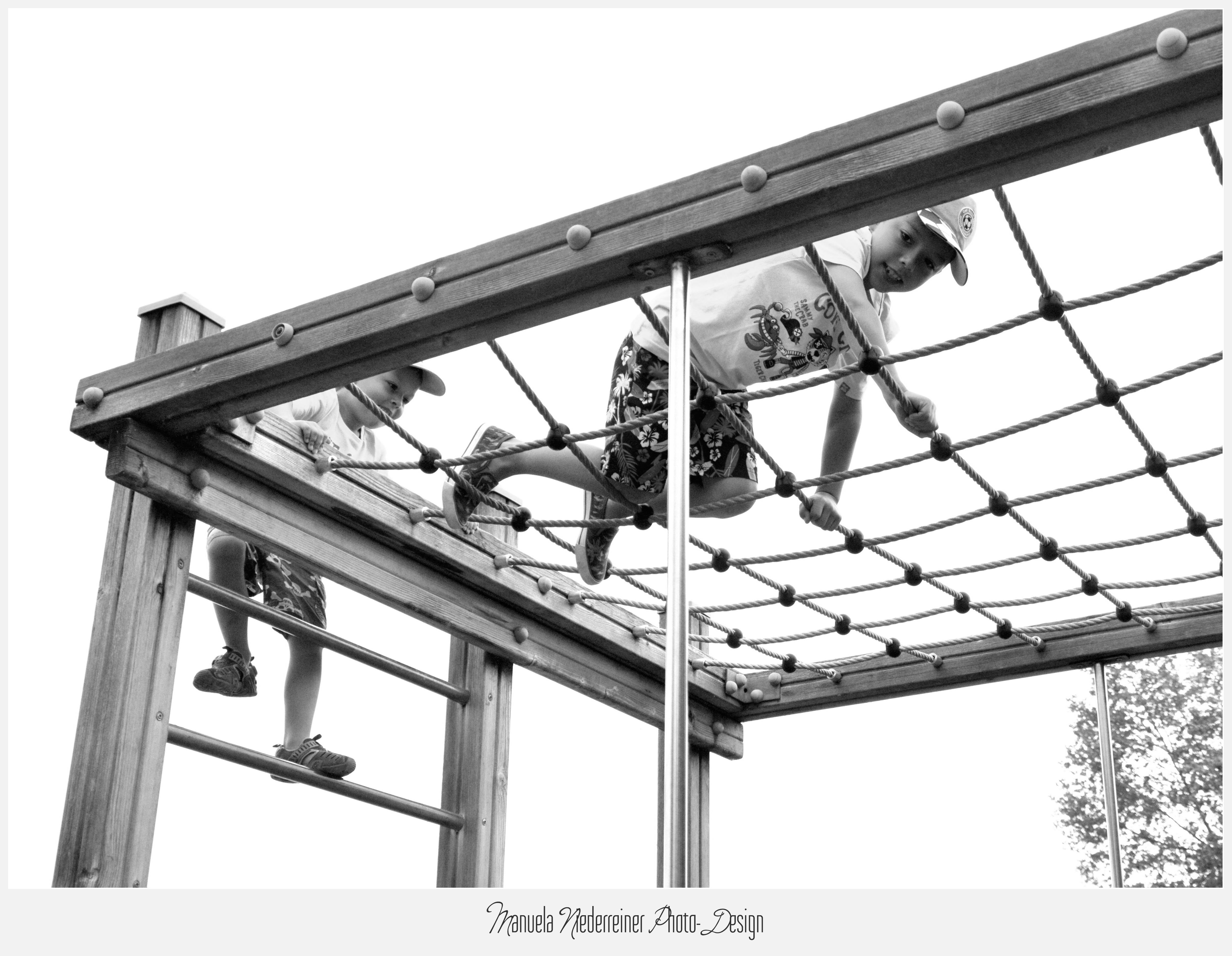
I feel immediately drawn to this image because of the interesting lines. The crop is great with the upwards diagonal line going straight into the corner. The movement and energy also add energy and tell a happy story of summer and outdoor play. I’m glad you chose an image with his foot moving up onto the next bar because it really highlights what’s happening in the scene. Typically, I prefer black and white conversion only when there’s dramatic directional light (like direct sun from the side) or when I’m trying to highlight a dramatic emotion. Because the light looks more even and the mood is playful, I would love to see this in color also. The boy on the net seems to be a little camera aware so it might be more impactful to see him laughing bigger or concentrating harder just for effect but it’s still very happy and playful as is. If I had this playset I’d definitely make one from square below the net shooting up as well. Seems like endless possibilities! Thank you for sharing this with us, looking forward to looking at more of your images!
Jodie:
What a fun image! Really screams out Summer holiday fun!
I love the flow through the image that the positioning and framing makes! The action of the climbing up and over the play equipment really cements the feel of flowing through the image as the frame of the ropes follows right through to the outer edge of the image.
I do feel that the silver pole that is very prominently centre and eye catching with the sun’s highlights hitting it a bit distracting and eye catching. I wonder that if by moving slightly to the right this may have been avoided as well as be able to minimise the tree in the bottom right corner, and be able to see a little more of the climbing boy on the ladder’s expression slight more completely. However as a mother of boys I am totally aware that these moments are so fleeting that telling the kids to hang on a sec to get in a better position is paramount to not even getting the image LOL I love the hint of the smile on both boys.
In a post processing thought I would probably have removed the tree in the bottom right corner. I know that it gives a sense of location but I feel that the clean feel of the image is drawn away a little bit with it almost cluttering the corner. The rest of the image is really clean lines and clear background. Its not a game changer for the image though, just a personal thought of an editing possibility.
Overall I feel this image is a solid documentary image that tells the story of fun spring/summer day at the park or play ground that really captures the essence and feelings of that experience.
Vicki:
This is a great image which is a strong and bold image of play. It has a strong composition, using the play frame to give structure to the image. The lines are well placed to frame the children and the tree in the background gives the sense of being in the park. I love that this is a different perspective of playing in the park too which adds to the composition.
That said, they are clearly having fun and I love the feeling of adventure and you can see that the first boy (big brother?) is being very brave and is eagerly followed by the second boy. There is a strong sense of story telling, I’d like to see the image once they’d made it over the top too!