Community Critique – Brian

Community Critique

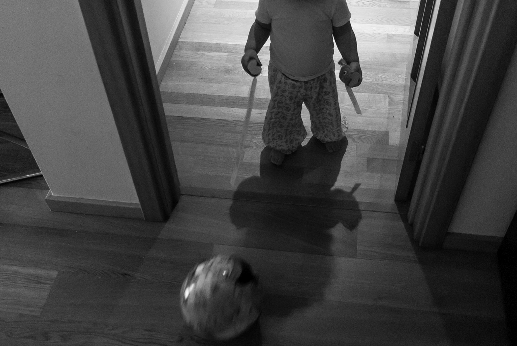
This week we have a photo submitted by documentary photographer Brian who took this photo of during one of his family sessions. This image was shot with a Fuji X-E2, ISO 3200 and f2.

Critique today comes from Erika and Heather.

Erika:

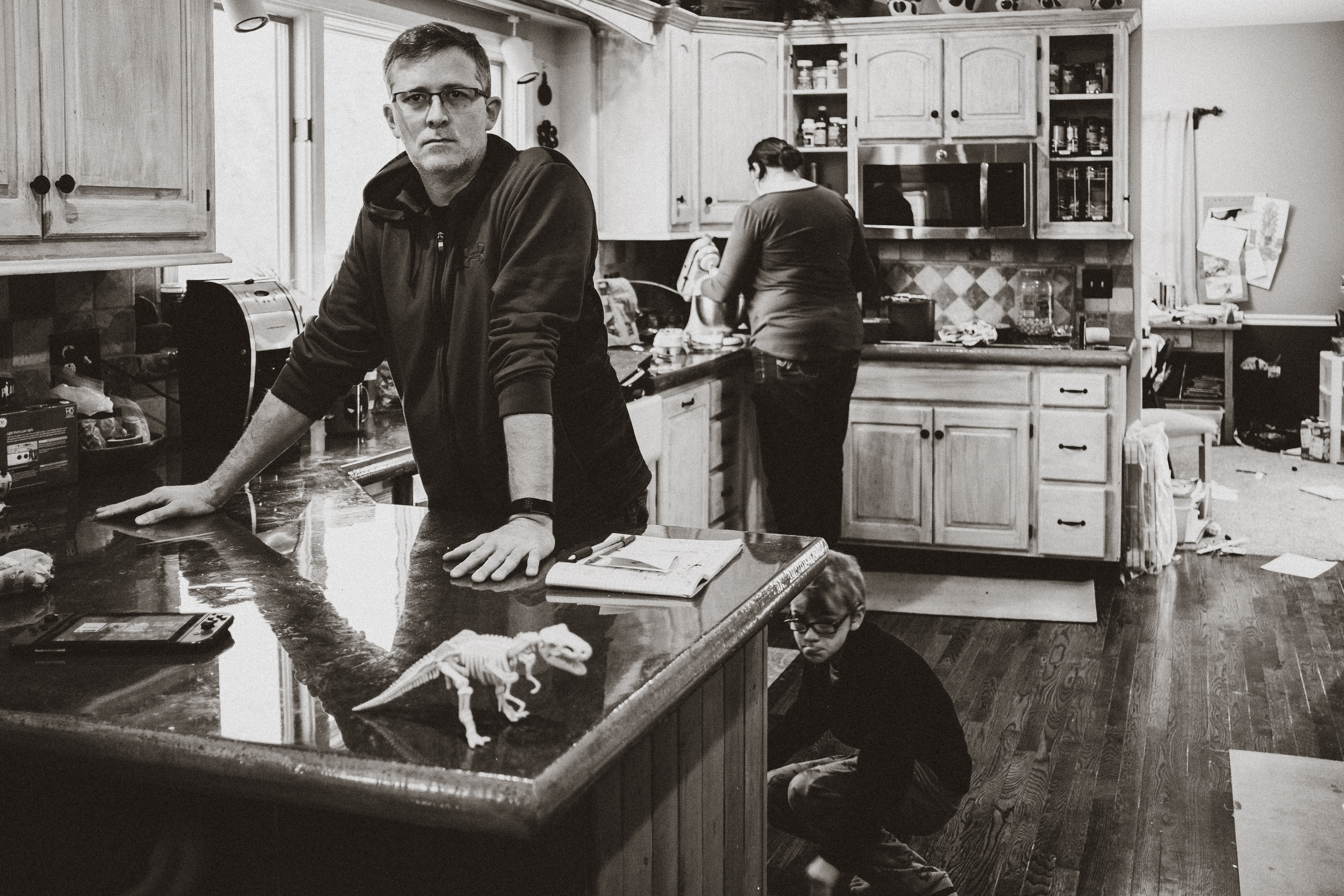
Hi Brian! Thanks for sharing this image with us. I love how much there is to look at in this image and, while I’ve not seen the original file, I’m certain converting it to BW was a great choice. There’s some real nuance present in this image that would be easily lost with the amount of color that is inevitably present in a kitchen like this one.

I think the stance you’ve chosen is the best one as squaring up here would have caused you to loose the little boy crouching behind the the counter.

You’ve done a nice job of composing the different elements in this image as well. You have dad’s head nicely framed in the window behind him. Mom’s head, in the background, is nicely placed in the empty space provided by the cabinet. There is only some slight overlap with the boy towards the floor where he aligns with the bottom of mom’s legs and has a bit of counter top intersecting the top of his head. I really love that the dinosaur in the foreground is nicely placed in the dad’s reflection, providing just enough contrast for that really quirky point of interest to “pop” in this image.

I am curious why you chose to make the father the focus of this image. The story I see unfolding is the little kid creeping behind the counter, making a face, unbeknownst to their father. Thus giving them the action and the primary place in this story and the father has the anticipated reaction and feel secondary in this moment. While the dad does have a strong gesture in the way he is leaning over the counter and his expression is engaging and intense those elements are not quite dynamic enough to compete with the action happening around him.

You might consider playing with the image and making a dramatic crop to cut out the child on the floor, just to see how it impacts the image. I suspect doing that might make the image a stronger environmental portrait, though you would lose some driving storytelling elements.

Heather:

Thank you for sharing your work with us. What great layers you have. Each of the family members in their own space and the dinosaur in the foreground.

This is completely my personal preference but I would love to see this in color. I am sure B&W was the best choice but I would still like to see it both ways 🙂

I am curious why you waited for a moment that the dad was looking at the camera vs a moment when he was also busy?


*****

Interested in having one of your images critiqued? Check out the submission guidelines.

Community Critique – Nuno

Community Critique

This week we have a photo submitted by Nuno who is working on a project called “Explorations” which is about photographing his daughter as she explores throughout their house . This image was shot with a Nikon D200, ISO 500, f3.3, and SS 1/80.

Critique today comes from Heather, Celina, and Robin.

Heather: What a sweet image of your little one. I love that you converted it to black and white. It helps focus the mood and brings your attention to the baby. I am a huge fan of shadow images. I think that I would like to see the whole body in the shadow or to see the face. I like that you used the door for framing the baby.

Celina: What a great idea for a series, I am sure you have plenty to document especially at this age. I love that your daughter has something in both hands and is kicking a ball all at once, it really emphasizes the exploration theme and chaos that comes with children. The lighting makes it feel like it’s really early in the morning or later at night which really adds to the story of the busy toddler always on the move no matter what time it is.

Personally, I am curious to see what expressions she has, I think that could have added to the story. Things do move quickly, but I would have tried to crop her a little lower at the shoulders or one idea would have been to take the photo from a higher angle and maybe tried to get more of her shadow and put emphasis on the ball even more. I do love the motion blur of the ball, it adds movement and a sense of urgency. I love a black and white picture but I am really curious how all the toys would look in colour. I am really looking forward to seeing more from this series and how it evolves as she grows.

Robin: I love the idea for your project! One of the first things I notice about this photo is the motion of the ball. I like that you chose a slow enough shutter speed to keep your child in focus but still captured the motion of the kicked ball. Using the doorway as a frame for her works well, too, and it draws my eye to her and the ball. I am normally a fan of images without a face, but I think seeing her face might have added a bit of interest to this photo – especially if she had an interesting expression (like excitement or concentration) on her face.  I wish I could tell what she is holding in her hands, and I find it a bit distracting that I can’t figure it out. I’m curious if it would been easier to see what’s in her hands had this photo been in color. I think squaring up with the doorway would have helped and possibly have allowed you to get rid of the distracting elements in the left side of the frame. If the setup of your house allows for that (I get that squaring up or backing up isn’t always an option), I would try a shot again like this and aim for more horizontal and vertical lines.

Thanks for your submission, and I hope you have fun as your continue on with this project.

*****

Interested in having one of your images critiqued? Check out the submission guidelines.

Community Critique – Jenni

Community Critique

This week we have a photo submitted by Jenni who was playing with manual settings on her camera while her son played on the slip and slide. This image was shot with a Lumix G7 and H-H025 lens.

Critique today comes from Erika, Jenny, and Carrie.

Erika: First, you did a great job nailing the exposure in this image. Direct sunlight is not always the easiest thing to shoot in and you did a great job here. Also, I really love the simplicity of this composition. You found a clean, uncluttered scene and took advantage of it. The gesture we see here from the boy is also good. We probably could have seen a more dynamic gesture while the boy was first leaping onto the slide but this is good; we see the limbs outstretched and can feel the movement across the frame. I also like that we are able to clearly see the hat for what it is, a dinosaur. While I really appreciate the care taken to make sure the fence posts in the back were straight, I do wish you had squared up to the water slide as well – though I suspect perhaps you were following the boy with your camera as he slid across the scene? Instead I would recommend setting yourself up in a static position with the slide running straight across your frame and then clicking the shutter as the boy moves across the frame instead of following him with your camera. You will still get multiple images to choose from but with a stronger, more graphic, composition. Lastly, when choosing your stance, I would suggest making the decision on whether to include or exclude the end of the slide. Here we get a hint of where the slide is ending because we see the blue trim but it’s clipped by the end of the frame. I would have preferred to see the entire end of the slide in this instance.

JennyFirstly, well done on making this image in full sun, near water and with a new camera! It screams summertime as a kid to me – the sprinkler, the slip and slide, the dinosaur hat, and the hours of fun to be had! I think your exposure looks great and I really like the movement you captured of him sliding, but I wish I could see a bit of his face to see his expression, even if it was just a hint of a smile or mouth open screaming and laughing. I think you could’ve caught that if you had squared up to the slide and shot it straight on by just waiting for him to slide by. I also would crop it a bit tighter to get rid of the top of the fence as the water isn’t going up that high and it’s not adding anything to me. You could do this by getting down really, really low to his level, to the point of laying down in the grass so the focus is really on him, the sprinkler and the slide. We don’t need to see the whole slide to know what is going on. I shoot my kids in the sprinkler and at the beach a lot without any kind of underwater housing so I know it’s what like having your camera near water, but don’t be frightened by a few splashes. Don’t go dunking it in the water or anything, but a little bit of water splashed on it won’t hurt it. Great job and enjoy your summer capturing a lot more images like this!

CarrieWhat a fun image that makes me excited about summer! You did great with properly exposing in full sun with a subject wearing a white shirt that could’ve easily been blown out. Composition wise, I did have to study the image for a bit to figure out what was going on with his R arm. The fact that I can’t see his hand gives the image a slightly uncomfortable tension. Sam Abell says that a good image consists of setting, expression, and gesture. You’ve established the setting nicely. I do feel the image would have greater impact if we could see a bit of his expression. Without seeing any expression, an image needs to really make up for that with a HUGE gesture. You have a bit of a gesture with his body but not quite enough to make up for not being able to see his expression. Like the other ladies, I think squaring up to the fence would be better than shooting slightly diagonally to it. So select a composition, don’t move your frame, and let the subject come into your frame. It takes a lot of patience but this is a great kind of activity for that exercise since he’s repetitively doing the same activity! I love the bright colors and your clean edit here. Keep on shooting!

*****

Interested in having one of your images critiqued? Check out the submission guidelines.

Community Critique – Saskia

Community Critique

This week we have a photo submitted by Saskia van Dantzig of her children cleaning the car at the carwash, and one of them was not enjoying the loud noise of the vacuum. This image was shot with a Canon 6D, Sigma 35 mm and the specs are ISO 320, F4.5, 1/800.

Critique today comes from Lisa, Celina, and Jessica.

Lisa: When I first saw this image I smiled, and I knew exactly what was happening.

Technically, I think your settings were great. Great use of layering. I like that you chose to shoot this at f 4.5 so that the boy in the foreground isn’t too out of focus, because he helps tell the story. I like this composition. The red hose acts as a leading line and tells me to look at this boy vacuuming, then my eye goes to the boy in red who completes the story for me with his expression and hands over his ears. I love the pops of red everywhere. I feel like it connects all the pieces of this story and helps us understand where they are. Initially, I thought I wanted you to step back to include more of the person in the foreground. But I like how tight this is because I feel that it adds tension that is appropriate for the message this image is conveying.

I find myself wanting to see more of his face. I wonder if shooting from an even lower view point would’ve helped us see more of his expression and help us feel how unhappy and overwhelmed he is with the vacuum sound. I would say to continue shooting through this moment to see if you can get an even stronger expression from the little boy. I know sometimes in this genre, it is what it is, and I think you did a great job with the circumstances you were presented with.

Overall, I think the story in this image is very clear, anchored by a clean and balanced composition. Also, it has great emotional impact because the content is very relatable.

Celina: This photo made me smile! I just love the colours and story here. I can tell your son is upset but it wasn’t until I read your description that I realized it was the noise he wasn’t happy with. Maybe you have a shot where it’s more clear he is blocking his ears. Either way, we get a sense of what is going and how tough life can be sometimes. I really like the crop and compositions. I think your choice of aperture is good but can’t help wonder if the background was a little blurred, the focus would be more on your son’s reaction. I keep looking at the small face in the very back, it looks like it could be you in the side mirror of the car. Now that would be epic! As for post-processing, this looks like a clean edit, I personally like more contrast but that’s personal taste. Perhaps the only thing I wished for was seeing your son’s face a little more or that his expression was even more pronounced, but we all know that things don’t always go as we hope for. Overall it’s a really great image with a great moment captured showing us all that childhood can be.

Jessica: I like the idea here- the repetition of the red, the layering to tell multiple parts of the story. I find the brightness of the sky to be a bit distracting, however, and wonder if there is a way you could crop that out, or if you had gotten down on your son’s level a bit while shooting if it would have taken care of that. I also wish there was a bit more contrast since the light isn’t that dramatic- increasing contrast in your post-processing here might help the foreground and background separate a bit more and all the subjects pop. Your husband’s body and the shape of the hose add the idea of an organic element, but since they take up so much of the foreground my eye feels a bit pulled to them when I think the main story is your son and his reaction/ expression. I like how you said you shot several frames, trying different ways to capture the story. My recommendation in shooting a fairly busy, complex frame like this in the future would be to really move around the scene and look for ways to compose out anything distracting and draw attention to the main part of the story. Perhaps coming around and shooting over your husband’s shoulder (if you could have still included the hose) while aiming at your son would have been a cleaner shot. Overall I like the frame and love the color repetition and moment you chose.


*****

Interested in having one of your images critiqued? Check out the submission guidelines.

Community Critique – Alice

Community Critique

This week we have a photo submitted by Alice Pinetti for critique. This image was shot with a Nikon D90 and AF Nikkor 28-105 f/3.5-4.5D, and the specs are ISO 3200, aperture f/3.8 and shutterspeed 1/50. Alice explains, “Ennio just loves to be part of everything that goes on in our home and the daily shower is his favourite moment. Finally free of every garment he climbs up into the shower to take his part in Amelia’s water games.”

Critique today comes from FeliciaLeslie, and Jenny.

Felicia: Alice, it is clear from your description of your image that this moment is really meaningful to you! First, good job on shooting in the bathroom in ambient light! The white balance seems to be close to what it would have been in reality. The other thing I noticed about this image is the amount of digital noise it has. I am looking at your Camera and settings and see that with the D90, you are probably pushing the limits on ISO at 3200. It’s actually commendable that you managed to freeze as much as you did of Ennio’s motion at 1/50!

Shooting a photo in portrait orientation is not as common as landscape because our eyes like to read across, from L to R. If you are choosing to shoot in portrait, it would be for reasons like accentuating/emphasizing the vertical height of some elements in the frame. In this case, I don’t know if it is necessary to shoot in this orientation, or if shooting landscape would mean chopping off Amelia’s legs or Ennio’s feet because you are on a crop sensor and it’s too tight. But if you can when this happens next time, try shooting landscape and think about including some of the garments that Ennio’s left behind (if it’s on the floor) or square up facing the shower door so that you can capture more of his body language to show his effort in getting in to the shower. Maybe his arms trying to balance on the other side of the door, or his and Amelia’s facial expressions (unless you are intentionally trying for anonymity!). Diagonal lines like the ones you composed for can be effective leading lines but with a portrait orientation, they get truncated so their effectiveness is short-lived. The good thing about this moment is that it will likely repeat often, so you can keep working to get different perspectives on your shots!

LeslieAlice, I like that there is a sense of mystery in this image. While, I’m usually a big fan of faceless images because they are intriguing, I think this image might have been stronger if you had captured a bit of Ennio’s face or hands. It would have added a bit more interested to the image and allowed the viewer to identify more with what is going on. Your choice of shooting in portrait orientation is drawing my eye upwards when I think your intent was to get me to focus on him getting in the shower.

That being said, I love that you have this image to look back on and remember this every day occurrence. If you want to try again, I think an interesting perspective might be to capture shoot from outside the bathroom door or use the bathroom mirror. Reflections are a great way to add visual impact to the story and I especially like them for more intimate moments.

Thanks for submitting.

Jenny: Alice, I love that you captured this! My daughter used to do the same thing as a baby and it was the sweetest, so I know firsthand that this will be such a great memory in the years to come for you, Ennio and Amelia! I know bathrooms can be tricky to shoot in with both space and light, but you’ve done a great job here with pushing the capabilities of your camera. I’d be interested to see this in black and white and if that would help a bit with the noise. Had there been colourful clothes on the floor, or baby toys, or anything with colour that added to the story I would keep it as is, but I don’t think that the colour is adding anything here and black and white would’ve been my first choice.

I’m predominately a horizontal shooter, and really only turn the camera vertical if I want to emphasise the height of something, to highlight specific lines, or if I really can’t get everything to fit horizontally that I want in the frame. Space may have been the reason here, but if you were to try to shoot this scene again (which knowing babies and their repetitive behaviour, you probably have the chance most days!), I’d aim for landscape and try to add a few more details into the frame.

Great job, and gorgeous memory captured!


*****
Interested in having one of your images critiqued? Check out the submission guidelines.